Early in 2019 I started working on something calleed The Onion Dungeon. Later I gave it the much worse working title of The Dungeon of Five Anomalies, before eventually settling on calling it Sanctimonious Slimes Versus Expired Epicures. It was meant to be the third in a loose trilogy of works, following Mice with Legitimate Grievances and The Daschund Dungeon. Not that the works have any narrative link between them, but they share a keying style I was experimenting with, and were all intended to be made quickly and sold cheaply. SSvEE failed to get made quickly, but in all other respects I'm pretty happy with it.
One of the things I'm happiest with is the dungeon's map. I really leaned into the idea of iterating on the map for this adventure. Normally I might only tinker with the map a little bit before declaring the layout complete and focusing on developing the text. For this adventure I left the map fluid for almost the entire time I was writing, and it underwent several dramatic changes over the book's development. I find those changes pretty fascinating, so I'mma record them here for posterity.
Considering I've got a whole other website full of my Dee and Dee thoughts, maybe this page ought to have gone there. But fuckkit. I feel like posting it here, and who is gonna stop me? You? With those scrawny little arms? I didn't think so.
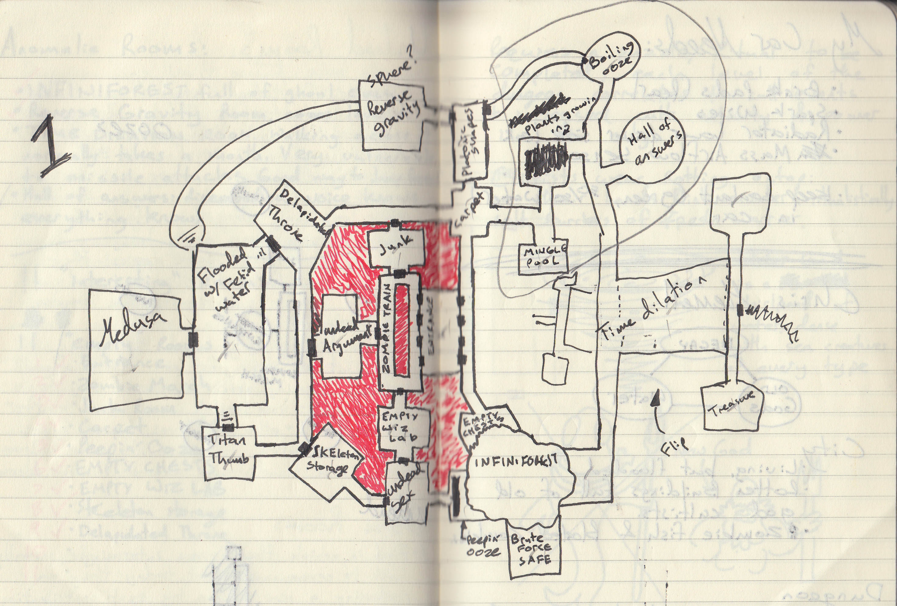
Frst draft for both map and room keys, scribbled across a spread of my pocket notebook between customers at work. Several ways to improve the map occurred to me even before I got home. Notably that the jaquaysing could be significantly improved if I added a connection in the northeast between the Reverse Gravity room and the room that's Flooded with Fetid Water. (Though I quickly switched that end of the connection to the Delapidated Throne). Additionally I realized the Time Dilation room would be much more interesting if I flipped it around so it could be accessed from both ends.
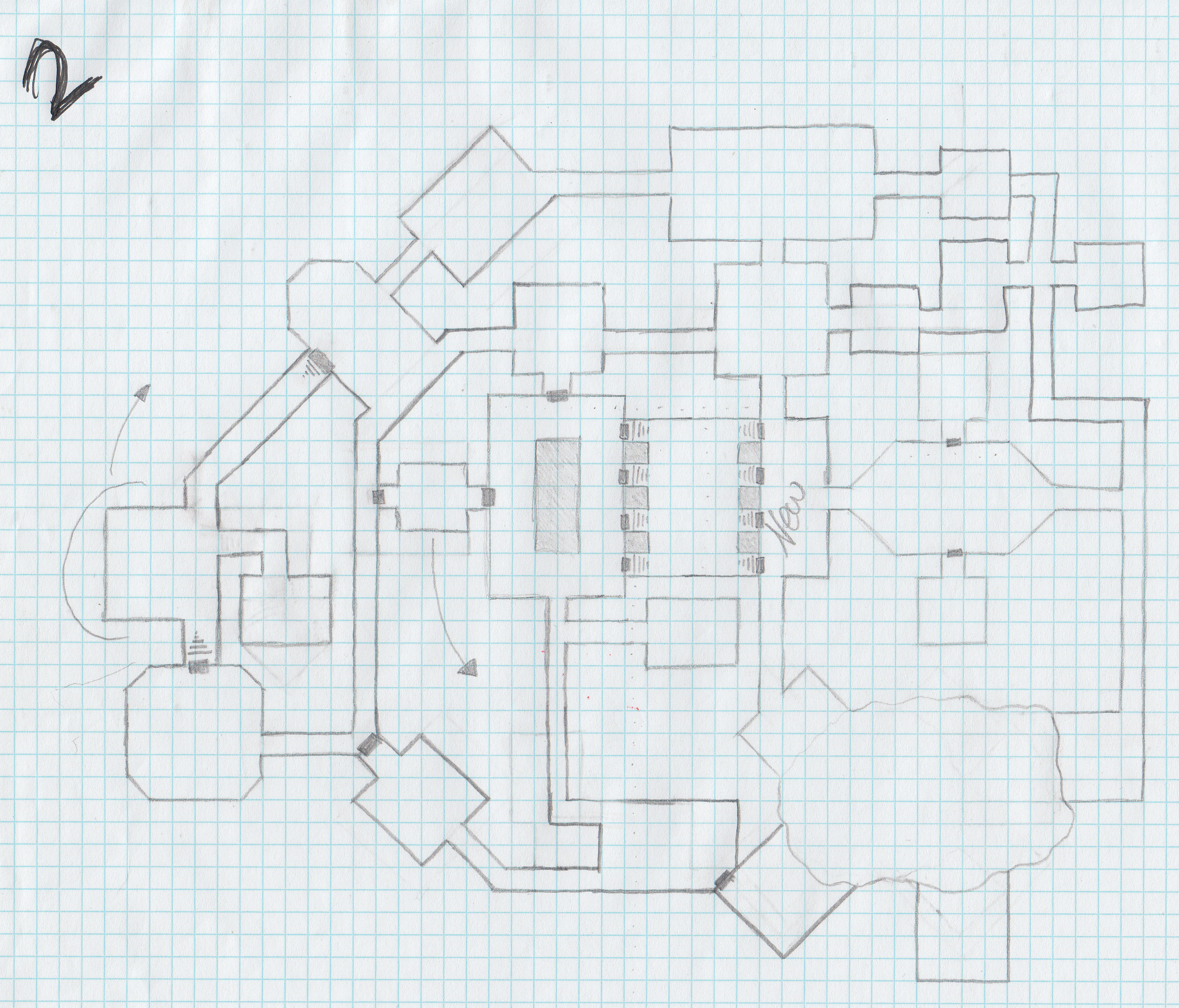
Mostly a cleanup job. I got the time dilation room flipped around, and moved the doors that were originally at its far end to its middle. This way players are forced to engage with the time dilation mechanic if they want to access those spaces. I added a room just east of the entrance so that going through those doors would result in something to explore, rather than just immediately presenting the players with three choices. (Oh, the entrance is the room at the center of the map with 8 exits.) I also added another room in the northwest so my Jaquaysing connection would not be such a long empty corridor.
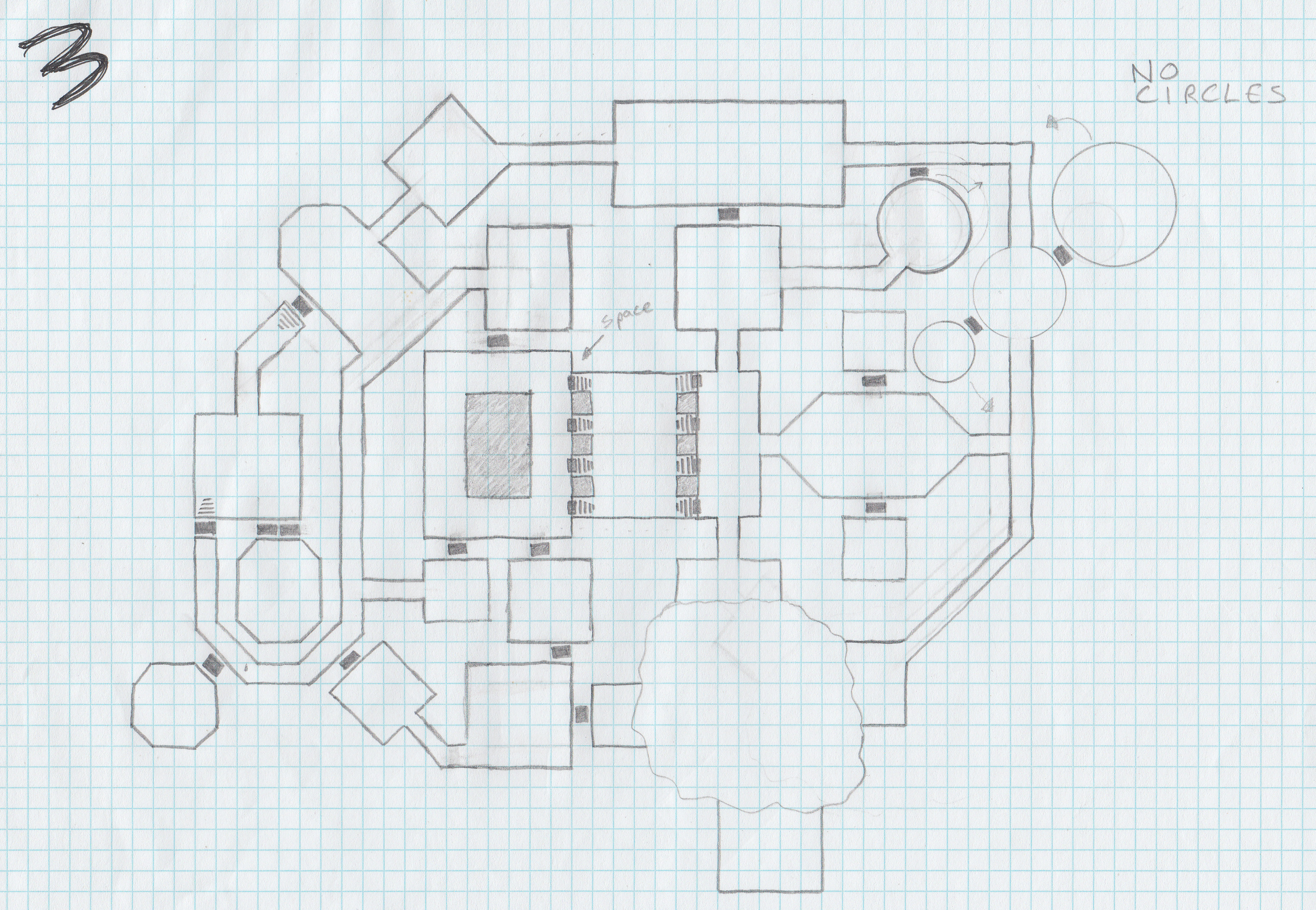
The third iteration came very quickly after the second. I'd had an idea for how I wanted doors to look that I was excited to get on paper. I fucked it up when I was drawing the entrance (damn all of those doors!), but I still love how this style looks. Another aesthetic concern was how boxy and boring the map looked. Cleaning up my notebook draft had made it into a very graph-papery dungeon. I tried to mitigate this by making the rooms in the upper right (the ones occupied by the Sanctimonious Slime faction) into circles. I instantly hated the way it looked, and wrote "NO CIRCLES" next to them so I'd undo it in the next draft.
Another major change is the removal of the hallway that was just above the entry room in the 2nd iteration. A good change I think. It is possible for a map to be too Jaquaysed¹. The rooms in the upper right also have an entirely different arrangement than they did in the previous version. I never could figure out an arrangement I liked. The first 5 versions of this map have these rooms connecting to each other in 5 entirely different ways, wheras the rest of the dungeon's layout changes in only minor ways after this point.
¹ I have a vague memory that I may have said the opposite of this in an episode of Go Die in a Hole which has not yet been released. I should schedule a debate stream with myself to discuss the question of whether or not a thing can be over-Jaquaysed.
Note that the rooms in the northeast are still circles. Fuck my past self. What does he know about dungeon design? Less than my current self, obviously.
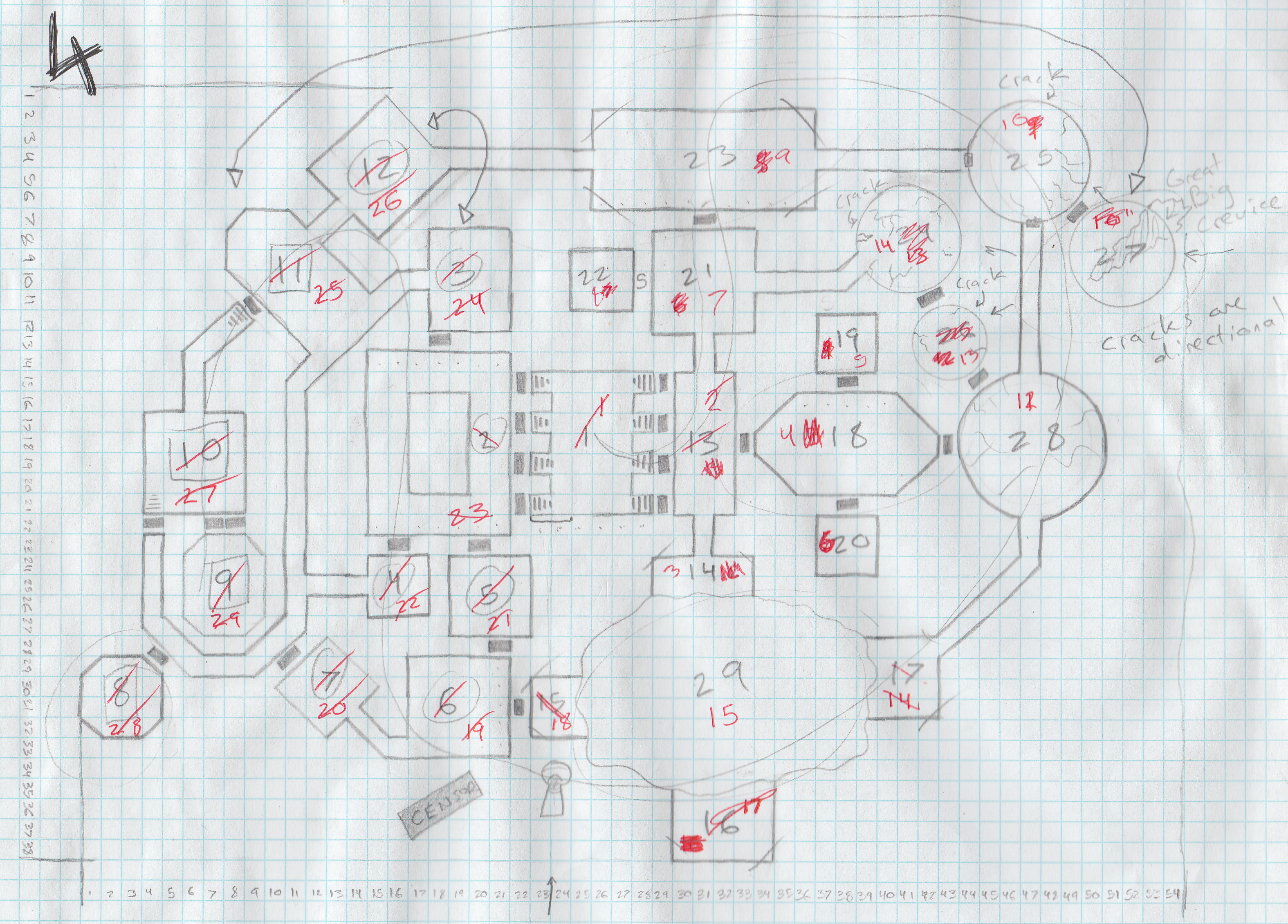
This is the version of the map I worked with longest. Aside from the complete reorganization of the rooms in the northeast, the most significant change is adding a secret room attached to area 21 / 7. It filled some of the blank space left by removing the hallway that used to be there. Plus, what sort of dungeon doesn't have at least one secret room!? A bad one, that's what! Also: I drew the doors correctly this time.
While working with this map I kept changing my mind about what order the rooms should be numbered in. Having several different numbering schemes written out on this map was confusing. Thankfully, I eventually realized that one of the rooms needed to move, so I had a good excuse to redraw the thing.
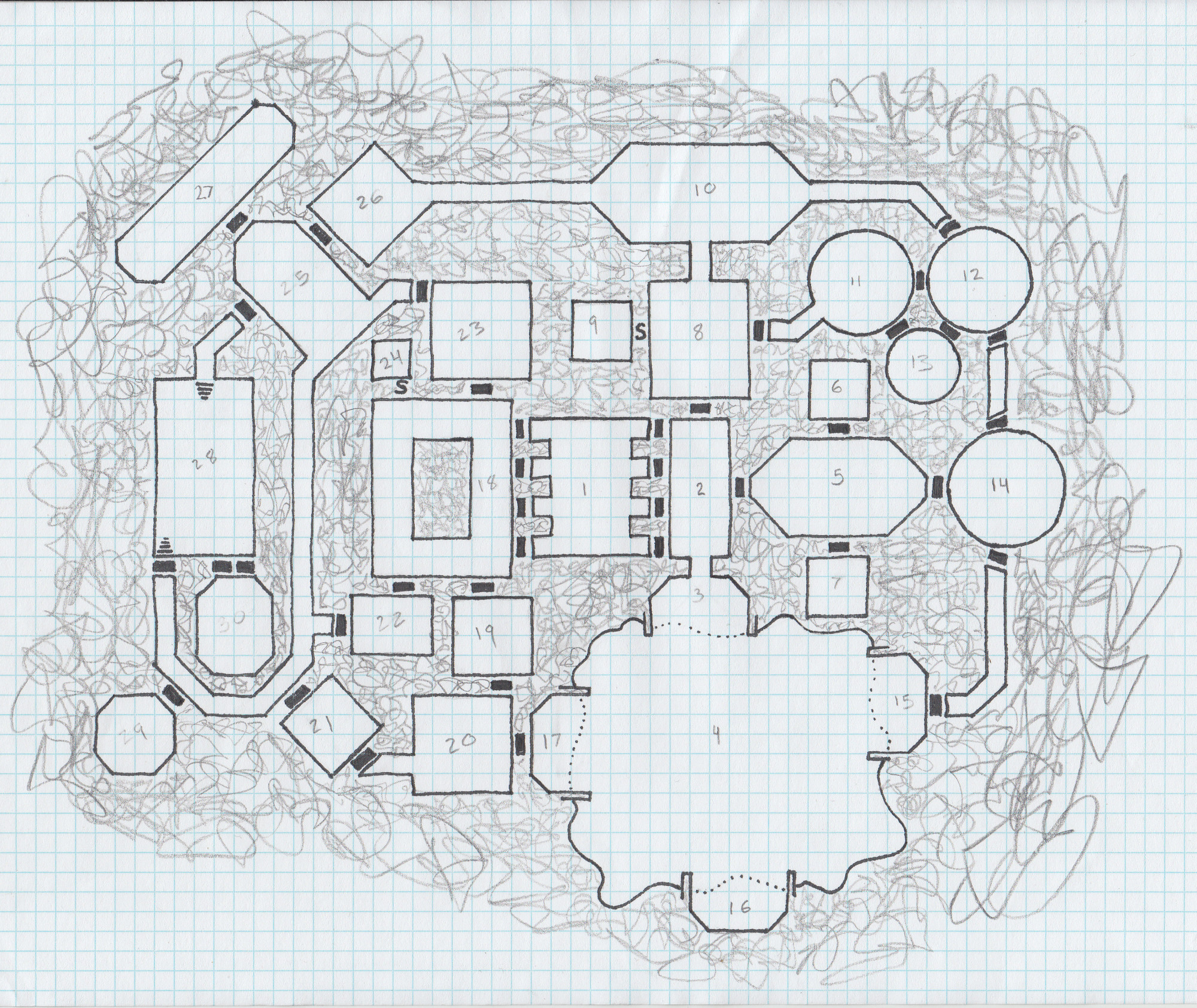
The fifth iteration finalized the arrangement of the rooms. Even those dastardly northeastern circles won't change again after this.
As indicated by an arrow on the previous map, one of those circles has been moved way over to the other side, and transformed into an elongated octogon. I'm really glad I left the layout flexible long enough to make this change. I think it significantly improves the flow of the dungeon, and feels so natural to me now that I'd actually forgotten it was ever anywhere else before I sat down to go through these old maps. Part of the core premise of this dungeon is that it was built around five dangerous areas of disruption to normal reality. Before this change all the anomalies were clustered together on the eastern half of the dungeon, which begged the question of why the western half was built.
I also opted to add just one more room: a secret one attached to area 18. There were already 3 doors in 3 corners of that room, and to me that implied a minor spacial puzzle. If players were paying enough attention to deduce there might be a secret door in the 4th corner I wanted them to find one. Also, adding it brought the room count up to a nice even 30.
Artistically, this is also the draft where I decided to angle the corners of the rooms associated with each of the dungeon's 5 anomalies. That's areas 5, 10, 27, 29, and all the rooms attached to area 9. It isn't meant as a clue. Those aren't even the only rooms with angled corners, but now the dungeon doesn't look boxy at all.
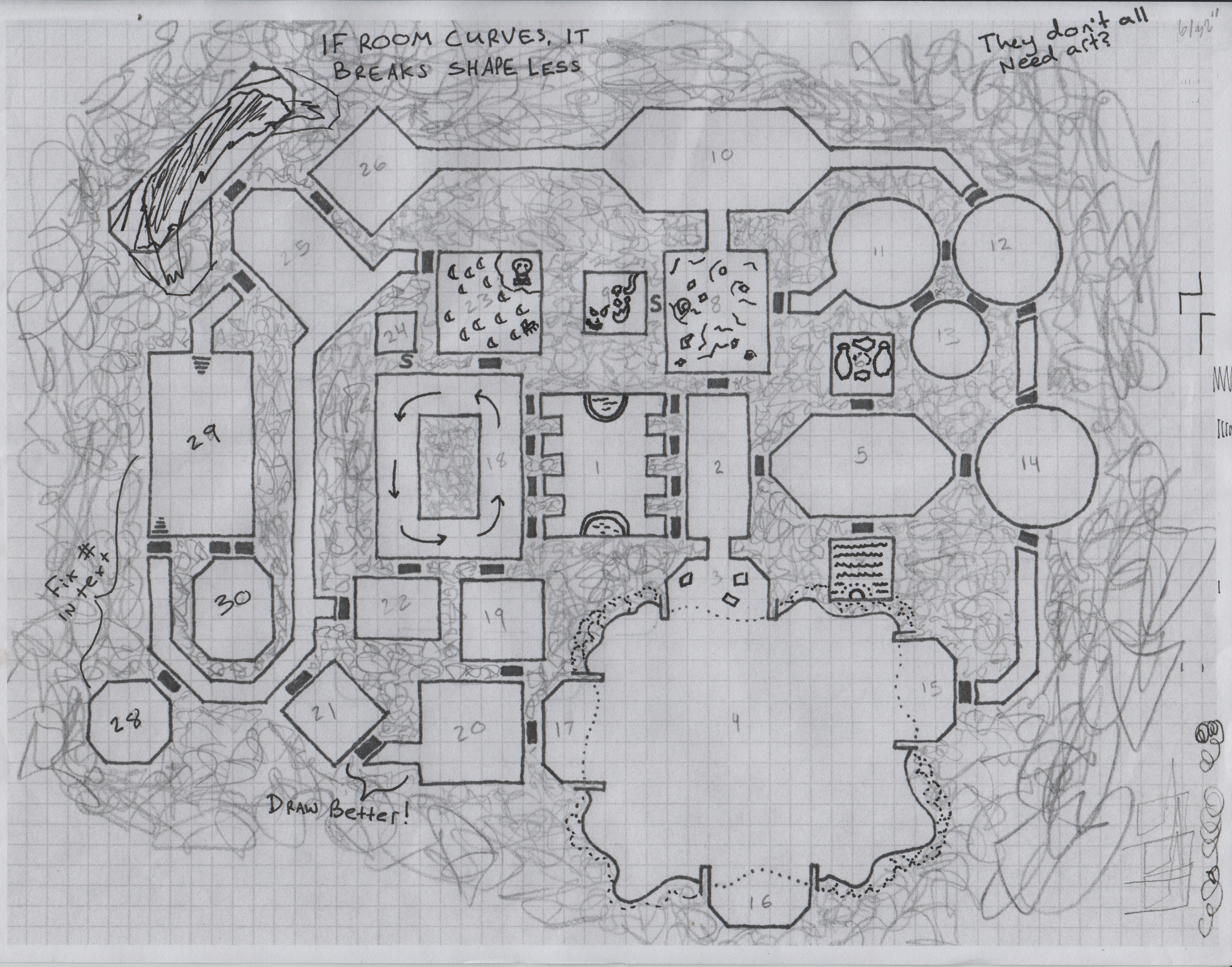
January 15, 2024 Update: I discovered this map while cleaning out my office. An interesting 'missing link' for this page. It's a printout of a scan of the previous map, but as you can see I've covered it with doodles and notes which pressage how the map would ultimately look in its final iteration. Of particular note to me is the alternate seating arrangement I considered for room 23, and the tree-shaped border on room 4.
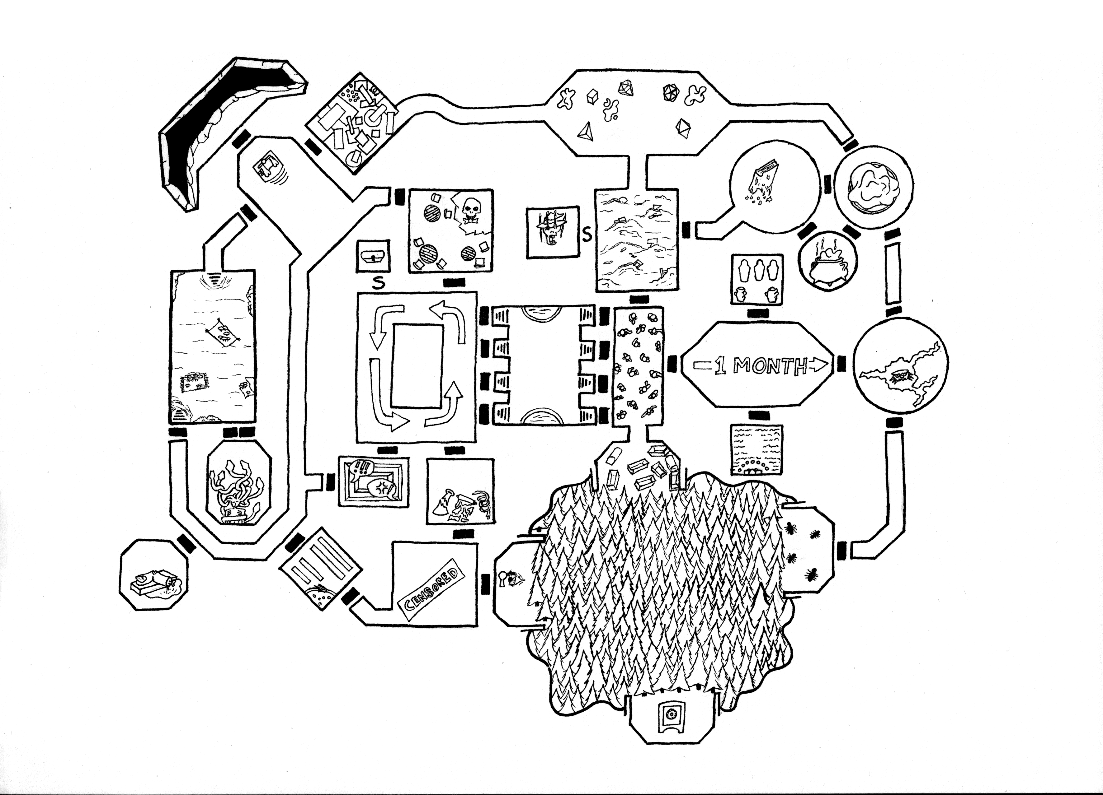
With the layout completed in the fifth iteration, and the accompanying text in the final stages of polish, I was ready to finalize the map's art. I sketched it with light pencil lines, then filled those in with ink once I was happy with the look. I actually have no recollection of how I got the grid to look so clean without graph paper? I might have used a light box and placed a sheet of graph paper under the paper I was drawing on; or I might have just used a straight edge and been careful to get my pencils right prior to inking.
I'm also putting my money where my mouth is by including doodles on each room, meant to be suggestive of the room's contents. The extra effort makes dungeons dramatically easier to run, even if the doodles are made by someone with artistic skills as limited as mine.
The art does get tweaked a couple times after this, but it's all done in GIMP rather than by hand.
I had a difficult time deciding what hatching method to use on the blank space between rooms. I should have thought about that earlier, but after all the effort I put into my illustration I wasn't inclined to go experimenting on my only copy. Whatever method I used needed to be added digitally.
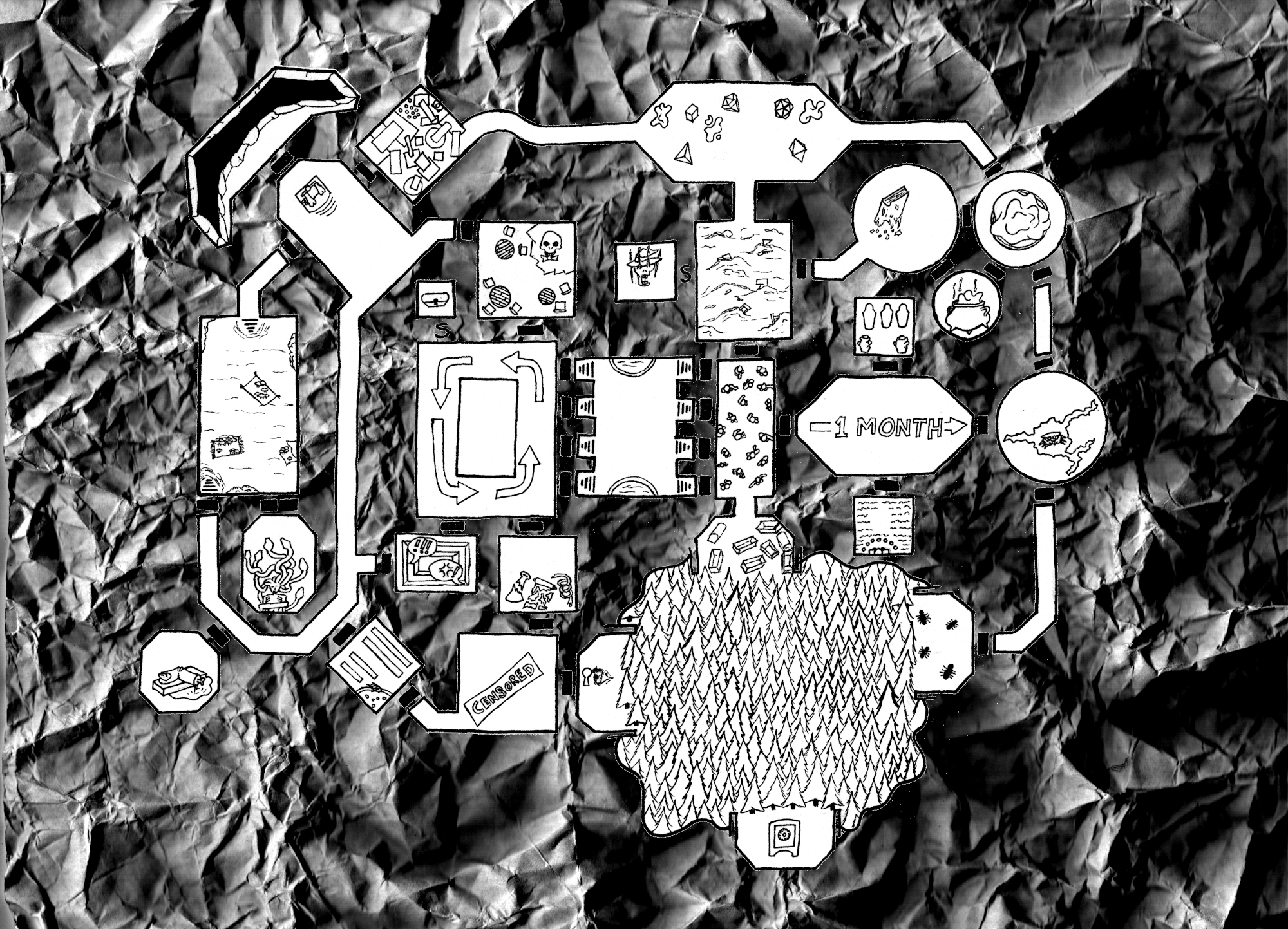
I thought I was being real slick with this first attempt. So low effort! All I needed to do was scan a crumpled up sheet of paper in greyscale, then crank up the contrast! Sadly, it looks like shit. The doors disappear into the background, and the juxtaposition of the 3D art with the 2D scan looks gross. I hated this so much that I overcorrected to an absurdly high effort alternative.
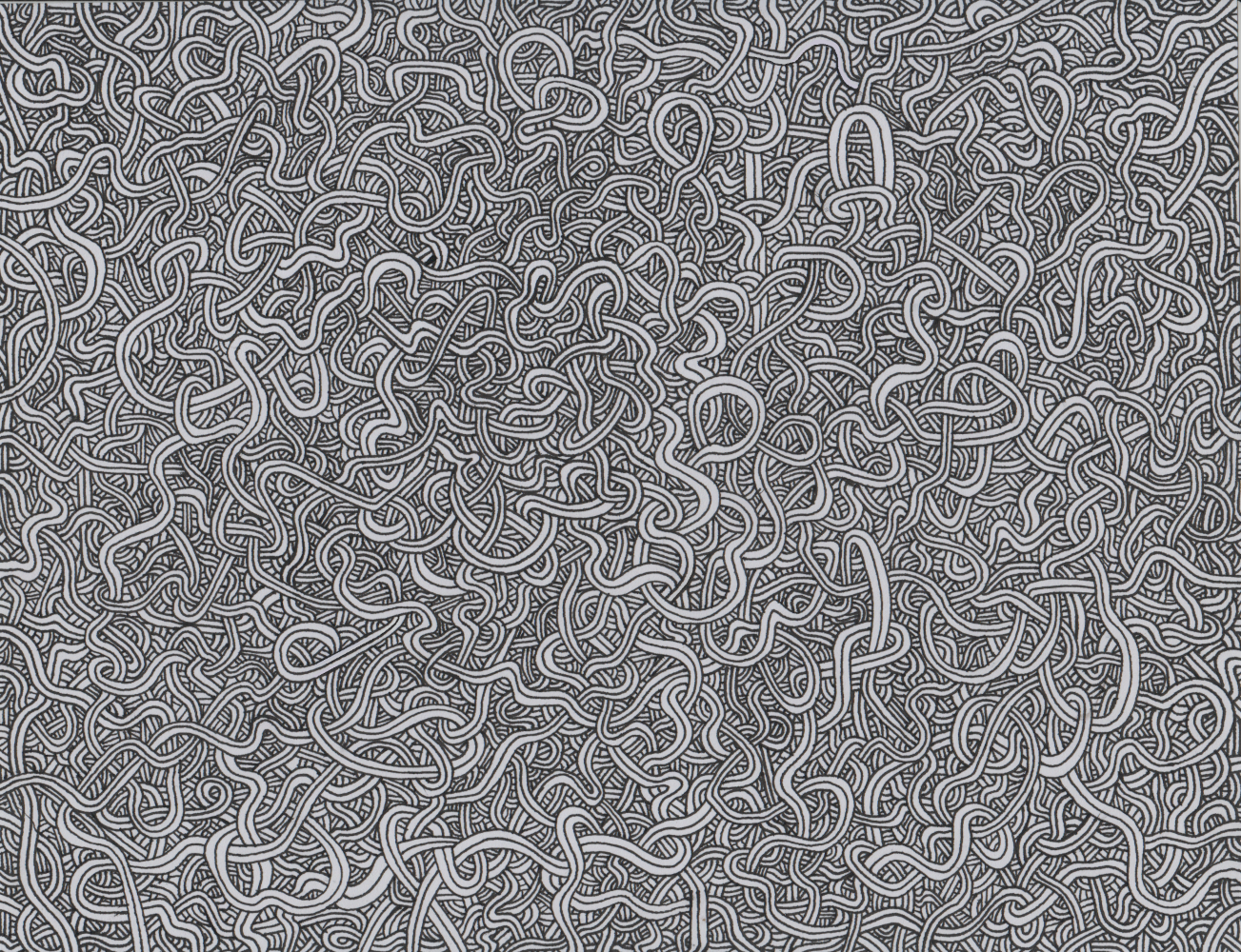
I needed a hand drawn hatch, so I filled a sheet of paper with wiggly squigglies.
This
Took
So
Fucking
Long.
I spent more time drawing this than I spent on any version of the map. I might have spent more time drawing this than I spent on every version of the map combined. Days upon days of carefully adding little triplettes of curves. This was one of those Sunk Cost Fallacy projects. I started before I realized how much effort I was comitting myself to. Once I did realize, I didn't want to waste the time I'd already spent by trying something different. Plus, as much time as it was taking, the results were looking slick.
This sheet of paper is pleasing to me as art in its own right. The time I spent drawing those lines was cathartic. The action was simple. Straightforward. The results were disproportionately beautiful. At the time I felt foolish for devoting so many hours to an aspect of the project with so little significance. Hell, half of what I was drawing was going to be covered by the map! In retrospect, though, I think that's just how art be sometimes. I allowed myself be drawn into a silly little thing that gave me joy, and even if nobody's attention is drawn to my sheet of wigglers behind the map, I think their presence adds an impression of quality.
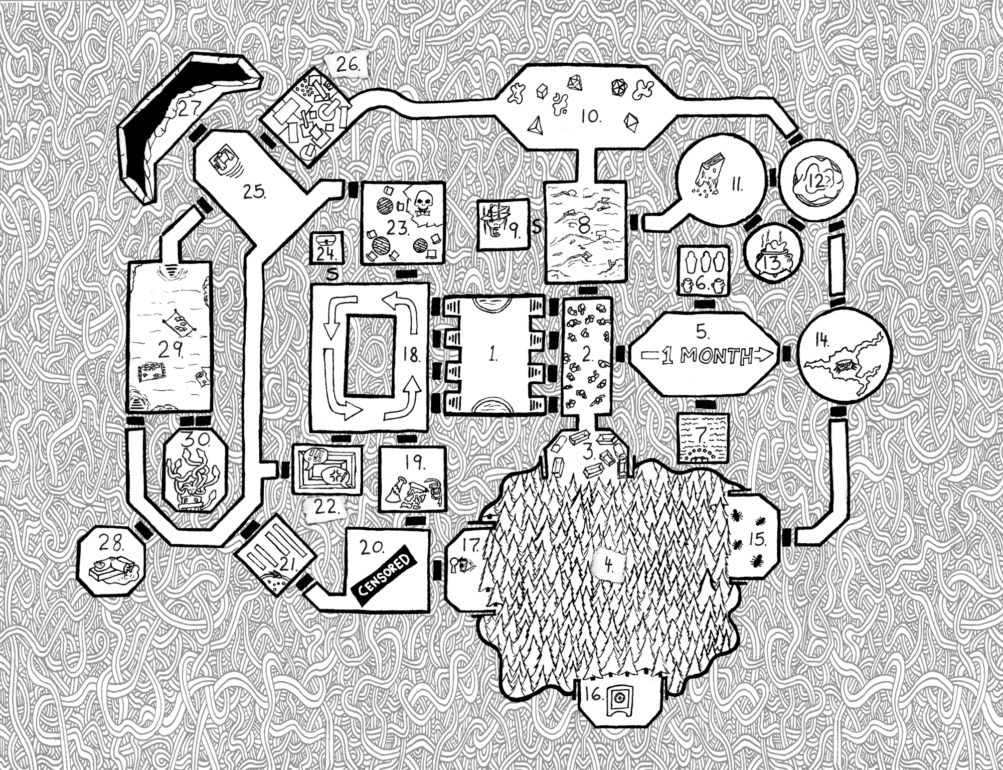
The final iteration of the map, as it appears in the book. I wrote out room numbers by hand, scanned them in, and added them digitally. I'm particularly happy with the paper scrap visual I created for the rooms that were too visually busy to contain their number. Also, for a few rooms I altered the art to make enough blank space for the numbers to fit comfortably (2, 3, 9, 13, 21, 24, and 27). I fixed the censored bar too. It didn't look right with a white background.
Even with as much time as it took to make, my wiggly squigglies needed to get smaller to achieve the right amount of visual noise. Rather than start over (there are limits to how much time I can devote to something, no matter how pleasing it is), I squished the art a bit, duplicated it, and mirrored it. I think I did a pretty good job hiding the seam. The two halves meet behind the longest vertical segment of the map, stretching from area 10 down to area 16. Once you see it, you see it; but I bet you didn't notice before I pointed it out. (Gods please I hope you didn't notice before I pointed it out!)
—Nick LS Whelan
January 22, 2023
Updated: January 15, 2024